Group fitness classes have evolved dramatically over recent years. No longer will you find the typical ‘legs, bums and tums’ afternoon class at your local leisure centre, instead we are now presented with a variety of different classes held in large gym chains, small studios and even workplace offices at all hours and all branded in different ways to give them individuality and build their own followings.
As a keen and regular participant in group fitness classes, I thought I’d explore the world of fitness and exercise branding for the classes that I attend every week.
First up, drumroll please… Pound
Created in 2011 by two female drummers, Pound is a cardio fitness class inspired by the infectious fun and energy that comes from playing the drums. Pound is rapidly appearing in a growing number of gyms across the UK and is taught by over 10,000 instructors in over 40 countries. The soundtrack to a Pound class is any kind of music with a strong rhythmic drum beat. The moves combine cardio, conditioning, and strength training with yoga and Pilates. They are simple to do and designed to encourage all abilities to take part in the class.
Pound refers to their collective as “a family of fitness rebels born to stand out, make noise and disrupt norms” and having been in a packed Pound class, I can truly understand the feeling they are trying to convey. There’s something very liberating about smashing your Pound Ripstix (lightly weighted drumsticks) together and beating the floor. It’s a freedom of expression and enjoyment as well as a way of unleashing aggression and tension from a hard day or week. Noise is encouraged from all class members - in fact, the more noise the better the atmosphere and every participant feels the buzz. The class is a fun way to meet new people and really does encourage a community and family feel from instructors and participants.
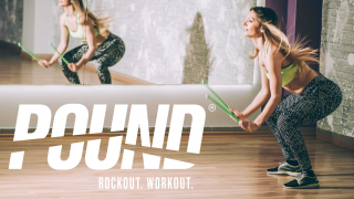
The brand identity for Pound uses chunky block capital letters giving the logo a bold and loud demeanour. The letters also have an italic forward slant giving a sense of movement and action. The letters have been broken up, with sections cut out of them to represent the Ripstix and this creates a cool, edgy feel to the logo and makes it seem more rebellious. All of these observations are traits that the brand emphasise in their brand tone, philosophy and messaging.
The majority of the imagery used in their marketing material is slick professional action shots from a Pound class with about 80% of the participants being females. This has probably been considered based on the common perception that more women participate in group fitness classes than men and so forms the focus of their target audience. From personal experience, I’ve only seen a handful of male participants in my Pound classes over the past year and so their understanding of the target market is spot on. The imagery also shows sweat, concentration and smiles — not purely picture perfect models barely lifting a finger, which was typical of traditional fitness classes. I think this makes it more accessible to the audience. The classes are pictured in modern studios, warehouse spaces and the black & white imagery with green highlights gives the brand a cool, modern feel.
Tone of voice and terminology gives the audience a good understanding of the class and benefits of the exercise. The strapline ‘Rockout. Workout’ is spot on. You really do turn up to class, rock out to some great tunes and exercise whilst enjoying the music.
Whether it's your own fitness brand, national repositioning or start-up venture, we can help from concept to market.


