


Accounting and business advisory firm HURST has unveiled a new brand identity as it prepares to mark its 40th anniversary.
HURST, which was founded in 1982, has replaced its strapline ‘Unlike Any Other Accountant’ with ‘Just Imagine’ and has introduced a new logo and typeface for its branding.
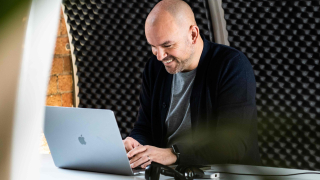
Alongside these measures, the firm’s website has been refreshed with new imagery, copy and client stories reflecting HURST’s strategy of building long-term strategic partnerships with ambitious entrepreneurial businesses across the north west.
Clients featured in the first series of testimonials are Arighi Bianchi, Bullocks, Continental Textiles, Cosatto, David Luke, Interpart UK and London Lash. HURST focuses on advising entrepreneurial, owner-managed businesses with turnover of £5m-£100m.
“This is our first brand overhaul for six years, and evolution rather than revolution has been the watchword in developing our bold new identity.
– Simon Brownbill, HURST's director of practice development
“There’s a clear link with the old branding, but this time around we are also showcasing clients to tell our story, to reflect the firm we are and the benefits of a HURST partnership, by emphasising what makes us different – the people, the expertise, the clients and the future.
“Inspiring our clients and putting our colleagues at the heart of the new brand have been key to the project – helping them to imagine what they can become and what they can achieve with us.
“It’s a strong, powerful and optimistic message which is designed to encourage our clients and staff to think bigger with us.
“We see this project, alongside our digital focus, as a statement of intent that both rejuvenates and future-proofs the brand, while also signalling the start of another era for HURST as a whole as we approach our 40th anniversary.”
Creative agency Fluid Ideas spearheaded the project, with more than 10 staff involved in creating the new brand, designing and developing the website and providing the imagery.
“We have kept the magenta piping that has been part of HURST’s visual identity for 10 years, and have used it to create an iconic and striking ‘H’ emblem formed in the negative space, which is more compatible with today’s digital world.
– Ed Bowler, joint managing director at Fluid
“The new typeface is a dark blue shade, and the ‘Just Imagine’ strapline is a phrase in everyday use which reflects aspiration and vision.
“HURST clients play an important role in the new website and help to reflect the firm’s values, passion and expertise and role as a true strategic partner. The website itself is faster, and works better than before on mobile devices.
– Ed Bowler, joint managing partner at Fluid
“The outcome is a vibrant, eye-catching brand identity and a website filled with inspirational stories which together convey a very strong and positive message about HURST and its future.”