Following on from talking about the cool and edgy styling of the Pound Rockout Workout, this time it's Bokwa in the spotlight.
As easy as 1, 2, 3... Bokwa Fitness
Bokwa was created in 2000 by Paul Mavi, and comes from his South African roots as a dancer and musician. Now based in LA, Paul has trained thousands of instructors across the world to teach Bokwa classes. Bokwa involves participants learning a series of steps that relate to numbers and letters. The idea is that when you are given the symbol, you draw the number or letter with your feet. Unlike traditional 8 count fitness classes, Bokwa does not require you to count, instead you follow movement and familiar shapes. This makes it easy to learn and suitable for all abilities, you can tone it up or bring it down to however you feel comfortable. The music involved in Bokwa is energetic and is the same feel good songs you’d listen to on the radio.
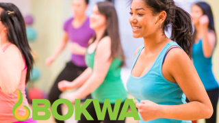
Bokwa is a cardio dance class that is full of energy, lively and loud. When I’m in a Bokwa class, there are happy faces singing along to the music, laughing and smiling if we decide to freestyle (when you get the moves wrong) and lots of shouting. It doesn’t feel like a work out because you’re having too much fun, so I’d say they’ve got their messaging just right.
The imagery used to promote Bowka is very familiar to the audience, showing home videos of different classes mixed with studio shot fitness routines typical with traditional fitness classes and DVDs. The imagery, like most other group fitness classes of this type, is mainly focused on female participants with a few men in the background. Something that sets Bokwa apart from other generic fitness marketing is that they have drawn focus on the creator, Paul, in a lot of their promotional imagery and videos. I think this gives the brand credibility to participants who can see that the creator of the programme is involved with teaching the class and the passion and energy he exudes is infectious. It really is his character that makes the class what it is, he even make drop in visits to classes across the world.
The Bokwa logo is bold and bright. The block capital letters give a strong sense of impact and they are simple in their styling – like the ease of movement involved in the class. The word Bokwa is made up of two parts: “Bo” from boxing and “kwa” from Kwaito, a genre of music from South Africa. This is also reflected in the steps and types of movements involved in the class. The icon that accompanies the logo has a sense of movement and also tribal connotations which could lead back to the African roots of the class origins and motion of the class. Once everyone in the class has mastered the steps and we’re all moving at the same time it’s a very impressive thing to watch. This coordinated movement along with the chants also has a tribal feel to it. Bright yellow and green colours give the logo life and energy and this summarises the essence of the class.
Bokwa is all about the fun, feel-good factor. It doesn’t matter too much if you’re not right on the beat or moving the right way. It’s an expression of freedom, losing yourself in the music and letting go. In this class we shout out loud and whoop, it’s a real party atmosphere. Even the instructor faces the same way as the participants, it feels as though they’re joining in with the class too.
Whether it's your own fitness brand, national repositioning or start-up venture, we can help from concept to market.


